

Zo lang doet een bezoeker over een blijvende eerste indruk van een website. De visuele identiteit wordt beoordeeld nog voor er één regel tekst gelezen is.How long visitors take to form a lasting first impression of a website. Visual identity is judged before a single line of copy is read.C'est le temps qu'il faut à un visiteur pour se forger une première impression durable d'un site. L'identité visuelle est jugée avant qu'une seule ligne de texte soit lue.
Lindgaard et al., Behaviour & ITCase study · Redactioneel merkCase study · Editorial brandÉtude de cas · Marque éditoriale
Look earned.
Een interne studie van onze eigen lopers. We brachten meer dan veertig loopclubwebsites in kaart en stelden een andere vraag. Hoe zou een club eruitzien als Nike, Aimé Leon Dore of Soulcycle ze zou runnen? Het antwoord werd een zwart merksysteem op magazineniveau dat de club behandelt als een performanceomgeving, niet als een vrijblijvende meet-up.An internal study by our in house runners. We mapped over forty running club websites and asked a different question. What would a club look like if Nike, Aimé Leon Dore or Soulcycle were running it? The answer became a black, magazine grade brand system that treats the club as a performance environment, not a casual meetup.Une étude interne, menée par les coureurs de notre équipe. Nous avons passé en revue plus de quarante sites de clubs de course et posé une autre question. À quoi ressemblerait un club si Nike, Aimé Leon Dore ou Soulcycle le dirigeaient ? La réponse est devenue un système de marque noir, de qualité magazine, qui traite le club comme un environnement de performance et non comme une rencontre informelle.
Het vertrekpuntThe starting pointLe point de départ
Elke loopclubwebsite ziet er hetzelfde uit.Every running club website looks the same.Tous les sites de clubs de course se ressemblent.
Er zitten lopers in ons team. Na meer dan veertig clubwebsites in België, Nederland en het Verenigd Koninkrijk te hebben bekeken, zagen we een patroon dat we niet meer konden negeren. Bijna elke site leunde op dezelfde vriendelijke, generieke beeldtaal. Lichtblauwe gradients, cursieve displayfonts, stockfoto's van lachende joggers en een homepage rond één knop: "loop mee met de volgende groepsloop".There are runners on our team. After looking through more than forty club websites across Belgium, the Netherlands and the UK, we noticed a pattern we could not unsee. Almost every site leaned on the same friendly, generic visual language. Light blue gradients, italic display fonts, stock photography of smiling joggers and a homepage built around a single "join the next group run" call to action.Il y a des coureurs dans notre équipe. Après avoir parcouru plus de quarante sites de clubs en Belgique, aux Pays-Bas et au Royaume-Uni, nous avons vu un schéma que nous ne pouvions plus ignorer. Presque chaque site s'appuyait sur le même langage visuel sympathique et générique. Dégradés bleu clair, polices display en italique, des joggeurs souriants tirés de banques d'images et une page d'accueil construite autour d'un seul bouton : « venez courir avec le prochain groupe ».
Het gevolg is dat loopclubs concurreren op geografie in plaats van op identiteit. Een fanatieke loper in Gent en een recreatieve loper in Antwerpen krijgen bijna identieke websites te zien. Welke club ze kiezen wordt in feite beslist door de postcode, niet door een gevoel.The result is that running clubs end up competing on geography instead of identity. A serious runner in Ghent and a casual runner in Antwerp are shown almost identical websites. Whoever they pick is essentially decided by postal code, not by feeling.Résultat : les clubs de course se concurrencent sur la géographie plutôt que sur l'identité. Un coureur assidu à Gand et un coureur occasionnel à Anvers voient des sites presque identiques. Le club qu'ils choisissent est en réalité décidé par le code postal, pas par un ressenti.
Dus deden we een interne studie. We bouwden dit niet voor een klant. We wilden weten wat er gebeurt wanneer je een club behandelt als een performance-lifestylemerk, zoals Nike, On Running of Aimé Leon Dore dat zouden doen.So we ran an internal study. We were not building this for a client. We wanted to know what happens when a club is treated like a performance lifestyle brand, the way Nike, On Running or Aimé Leon Dore would treat it.Nous avons donc mené une étude interne. Nous n'avons pas construit ceci pour un client. Nous voulions savoir ce qui se passe quand on traite un club comme une marque de performance et de lifestyle, à la manière de Nike, On Running ou Aimé Leon Dore.
De richtingThe directionLa direction
Behandel de club als een merk, niet als een communitypagina.Treat the club like a brand, not a community page.Traiter le club comme une marque, pas comme une page communautaire.
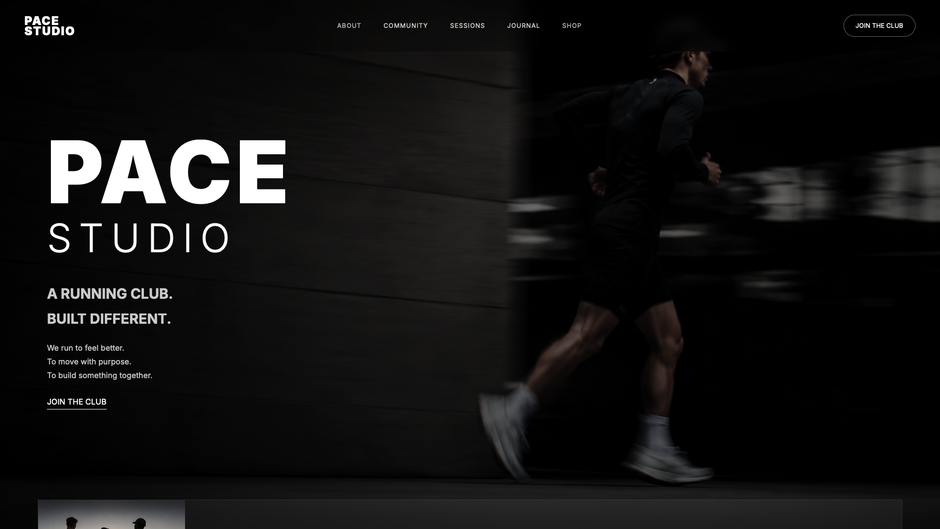
We kozen voor een brutalistisch redactioneel systeem. De homepage gebruikt een zwarte achtergrond, een uitvergroot gecondenseerd woordmerk en een raster zoals in een modemagazine. De fotografie loopt van rand tot rand, midden in de pas geschoten, zonder glimlach en zonder groepsfoto's. Het weekschema is gezet als een concerttourlijst. Leden staan opgelijst als een teamroster, niet in een "ontmoet de community"-carrousel.We chose a brutalist editorial system. The homepage uses a black background, an oversized condensed wordmark and a fashion magazine grid. Photography is full bleed, shot mid stride, with no smiling and no group photos. The weekly training schedule is typeset like a concert tour list. Members are listed like a team roster, not a "meet the community" carousel.Nous avons choisi un système éditorial brutaliste. La page d'accueil utilise un fond noir, un logotype condensé surdimensionné et une grille de magazine de mode. La photographie va de bord à bord, prise en pleine foulée, sans sourire et sans photos de groupe. Le programme hebdomadaire est composé comme une liste de dates de tournée. Les membres sont présentés comme l'effectif d'une équipe, pas dans un carrousel « rencontrez la communauté ».
Het doel was emotionele positionering. Een bezoeker moet meteen voelen dat dit een serieuze trainingsomgeving met normen is, geen hobbybijeenkomst met een drankje achteraf.The aim was emotional positioning. A visitor should arrive and immediately feel that this is a serious training environment with standards, not a hobby meetup with refreshments.L'objectif était un positionnement émotionnel. Le visiteur doit sentir immédiatement qu'il s'agit d'un environnement d'entraînement sérieux, avec des exigences, et non d'une sortie de loisir suivie d'un verre.
"De meeste loopclubs ogen toegankelijk. Wij wilden dat PACE verdiend zou ogen.""Most running clubs look approachable. We wanted PACE to look earned."« La plupart des clubs de course ont l'air accessibles. Nous voulions que PACE ait l'air mérité. »
VALE ontwerpnota'sVALE design notesNotes de conception VALE
Waarom dit ontwerpWhy this designPourquoi ce design
Elke keuze is onderbouwd door onderzoek, niet door smaak.Each choice is backed by research, not taste.Chaque choix repose sur des recherches, pas sur le goût.
Van de gebruikers zegt de geloofwaardigheid van een bedrijf te beoordelen op het websitedesign alleen. Voor een club die concurreert op ernst, is design het bewijs.Of users say they judge a company's credibility based on its website design alone. For a club competing on seriousness, design is the proof.Des utilisateurs disent juger la crédibilité d'une entreprise sur le seul design de son site. Pour un club qui se distingue par son sérieux, le design est la preuve.
Stanford Web Credibility ProjectVan de woorden op een gemiddelde webpagina wordt effectief gelezen. De rest wordt gescand. De positionering moet dus in de beeldtaal en de typografie zitten, niet in een introtekst die niemand haalt.Of the words on an average webpage actually get read. The rest is scanned. So the positioning has to live in the imagery and the typography, not in an intro paragraph nobody reaches.Des mots d'une page web moyenne sont réellement lus. Le reste est survolé. Le positionnement doit donc vivre dans les images et la typographie, pas dans un texte d'introduction que personne n'atteint.
Nielsen Norman Group, How Little Do Users Read?Wat er op de pagina staatWhat is on the pageCe qu'il y a sur la page
Een redactioneel systeem, geen homepage.An editorial system, not a homepage.Un système éditorial, pas une page d'accueil.
- Redactionele hero met paginavullende loopfotografie en een gecondenseerd woordmerk op de hoogte van het scherm.Editorial hero with full bleed runner photography and a condensed display wordmark scaled to the height of the viewport.Hero éditorial avec une photographie de course plein écran et un logotype condensé à la hauteur de l'écran.
- Schema in tourstijl. Wekelijkse trainingen gezet als een tourlijst, gesorteerd op stad, afstand en tempo.Tour style schedule. Weekly training sessions typeset like a tour list, sorted by city, distance and pace.Programme en style tournée. Les entraînements hebdomadaires composés comme des dates de tournée, triés par ville, distance et allure.
- Rosterpagina. Leden gepresenteerd zoals een team, met biokaarten in plaats van een communitycarrousel.Roster page. Members shown the way a team is presented, with bio cards instead of a community carousel.Page effectif. Les membres présentés comme une équipe, avec des fiches bio au lieu d'un carrousel communautaire.
- Longread over trainingsfilosofie. Een uitgebreid stuk dat de club een echte stem geeft en een reden om gevolgd te worden die verder gaat dan de locatie.Training philosophy long read. A long form piece that gives the club an actual voice and a reason to be followed beyond its location.Long format sur la philosophie d'entraînement. Un texte développé qui donne au club une vraie voix et une raison d'être suivi qui dépasse sa localisation.
- Strikt typografisch systeem. Eén gecondenseerde display, één neutrale grotesk. Geen derde lettertype. Geen sierletters. Geen gradients.Strict typographic system. One condensed display, one neutral grotesque. No third typeface. No script overlays. No gradients.Système typographique strict. Un display condensé, une grotesque neutre. Pas de troisième police. Pas de lettres ornées. Pas de dégradés.
Wat deze case ons leerdeWhat this case taught usCe que ce projet nous a appris
Het publiek wil al meer dan de categorie aanbiedt.The audience already wants more than the category offers.Le public veut déjà plus que ce que la catégorie propose.
Zelfs in een categorie zo druk als clubsport gaapt er een kloof tussen wat het publiek wil voelen en wat de meeste sites bieden. Lopers die vier keer per week trainen willen zich serieus, snel en stijlvol voelen. Bijna elke site in de categorie verkoopt hen gastvrij, vriendelijk en vrijblijvend.Even in a category as crowded as community sport, there is a wide gap between what the audience actually wants to feel and what most sites give them. Runners who train four times a week want to feel serious, fast and stylish. Almost every site in the category sells them welcoming, friendly and casual.Même dans une catégorie aussi encombrée que le sport en club, il existe un écart entre ce que le public veut ressentir et ce que la plupart des sites offrent. Les coureurs qui s'entraînent quatre fois par semaine veulent se sentir sérieux, rapides et stylés. Presque tous les sites de la catégorie leur vendent de l'accueillant, de l'amical et du décontracté.
Wanneer de beeldtaal aansluit bij het zelfbeeld van het publiek, gaat de rest mee. Dat is het principe waarop deze studie gebouwd is: een club die er ernstig uitziet, spreekt de lopers aan die ernstig trainen. PACE Studio is dat principe volledig uitgewerkt, van merk tot laatste pagina.When the visual language matches the audience's self image, the rest follows. That is the principle this study is built on: a club that looks serious speaks to runners who train seriously. PACE Studio is that principle worked out in full, from brand to final page.Quand le langage visuel correspond à l'image que le public a de lui-même, le reste suit. C'est le principe sur lequel repose cette étude : un club qui a l'air sérieux parle aux coureurs qui s'entraînent sérieusement. PACE Studio en est la mise en œuvre complète, de la marque à la dernière page.
PACE Studio blijft een conceptstuk. Als een club ooit zoiets wil lanceren, weten wij al wat we moeten bouwen.PACE Studio remains a concept piece. If a club ever wants to ship something like it, we already know what to build.PACE Studio reste un projet de concept. Si un club veut un jour lancer quelque chose de ce genre, nous savons déjà quoi construire.